Hello everbody!
Today I want to show you how you can get deeper insights into your Twitter followers with the help of R and show you how to cluster Twitter data. Because I just completed the course “Machine Learning” by Prof. Andrew Ng on Coursera I will use the k-means algorithm and cluster my Twitter followers by the ratio of their followers and how many people they follow.
Setup
Before we can get the Twitter data we have to authorize like I described here. But before we go one we make sure that we have installed rcharts:
|
1 |
require(rCharts) |
If it is not installed you have to install it with:
|
1 2 |
require(devtools) install_github('rCharts','ramnathv') |
Get the Twitter Data
We get our data in three steps. First we get the user object object, then we get the followers and friends of this user and then we merge it to a dataframe containing all these users and their information.
|
1 2 3 4 5 6 7 |
user <- getUser("JulianHi") #Set the username userFriends <- user$getFriends() userFollowers <- user$getFollowers() userNeighbors <- union(userFollowers, userFriends) #merge followers and friends userNeighbors.df = twListToDF(userNeighbors) #create the dataframe |
If you would plot this data now I couldn´t give you a lot of insight as the most data points would be in the left corner. It would look like this:

So what we do is a log transformation and use the log of all the values for our analysis.
Do do so we need to replace all 0 values in our dataframe with 1, because log(0) would result in -Inf values inside our dateframe.
|
1 |
userNeighbors.df[userNeighbors.df=="0"]<-1 |
Now we can apply the log transformation. Therefore we add the columns logFollowersCount and logFriendsCount to our dataframe which contain the log() values of the original columns followersCount and friendsCount we received from Twitter.
|
1 2 3 |
userNeighbors.df$logFollowersCount <-log(userNeighbors.df$followersCount) userNeighbors.df$logFriendsCount <-log(userNeighbors.df$friendsCount) |
Cluster the Twitter data
Now that we have our data we can start cluster Twitter data. Before we can use the k-means algorithm we have to decide how many clusters we want to have in the end. Therefore we can use the so called elbow method. It runs the k-means algorithm with different numbers of clusters and shows the results. Based on this we can decide how many clusters we should choose.
First we extract the relevant columns out of our dataframe and create a new one for our algorithm.
|
1 |
kObject.log <- data.frame(userNeighbors.df$logFriendsCount,userNeighbors.df$logFollowersCount) |
Then we can create the elbow chart and you will see why it is actually called elbow chart:
|
1 2 3 4 5 6 7 8 |
mydata <- kObject.log wss <- (nrow(mydata)-1)*sum(apply(mydata,2,var)) for (i in 2:15) wss[i] <- sum(kmeans(mydata,centers=i)$withinss) plot(1:15, wss, type="b", xlab="Number of Clusters", ylab="Within groups sum of squares") |
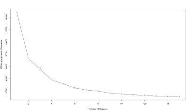
The best number of clusters it now at the “elbow” of the graph. In this case the best number of clusters would we something around 4. So we will try to find 4 clusters in our data.
|
1 2 3 4 5 6 |
#Run the K Means algorithm, specifying 4 centers user2Means.log <- kmeans(kObject.log, centers=4, iter.max=10, nstart=100) #Add the vector of specified clusters back to the original vector as a factor userNeighbors.df$cluster <- factor(user2Means.log$cluster) |
Plot the data
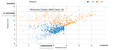
Ok now that we have our data we can plot it with the rCharts library.
This has the advantage that we can create easily an interactive graph which provides us additional information like the actual number of followers and friends as we can´t see it directly on the axes after the log transformation.
|
1 2 3 4 5 6 7 8 9 10 11 |
p2 <- nPlot(logFollowersCount ~ logFriendsCount, group = 'cluster', data = userNeighbors.df, type = 'scatterChart') p2$xAxis(axisLabel = 'Followers Count') p2$yAxis(axisLabel = 'Friends Count') p2$chart(tooltipContent = "#! function(key, x, y, e){ return e.point.screenName + ' Followers: ' + e.point.followersCount +' Friends: ' + e.point.friendsCount } !#") p2 |
You can find an interactive example of such a plot here
You can find the code on my github and if you have any questions feel free to follow me on Twitter or write a comment 🙂
This post was inspired by http://rstudio-pubs-static.s3.amazonaws.com/5983_af66eca6775f4528a72b8e243a6ecf2d.html


